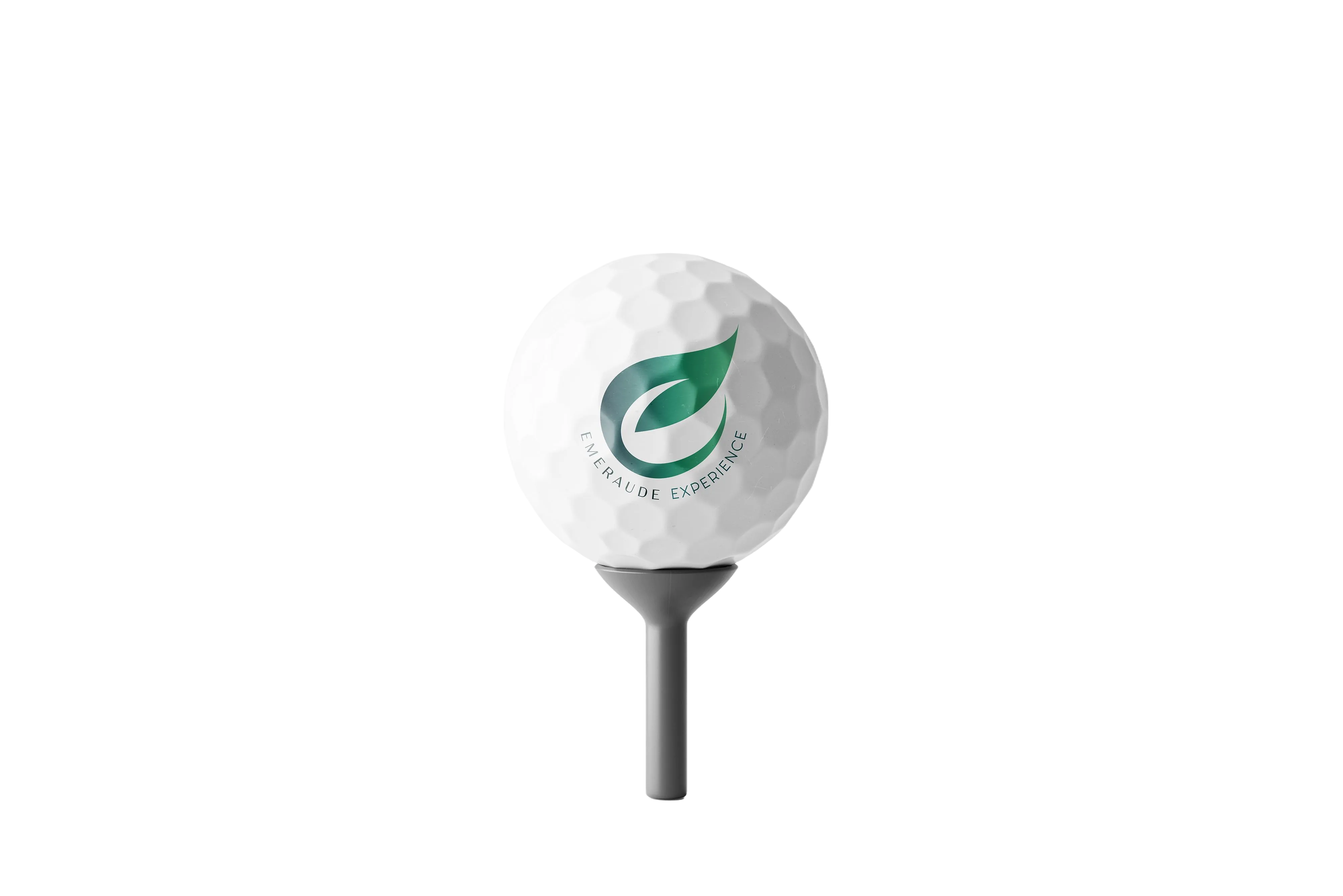
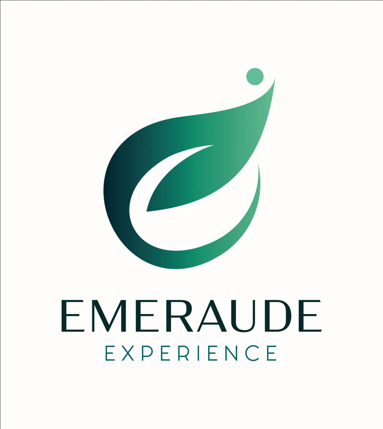
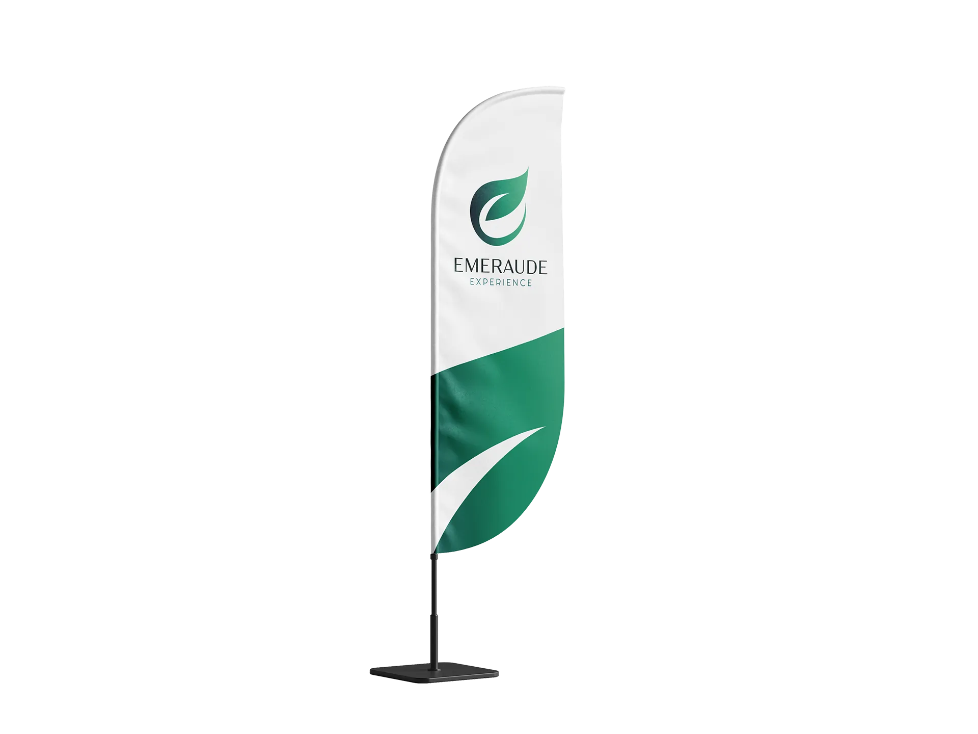
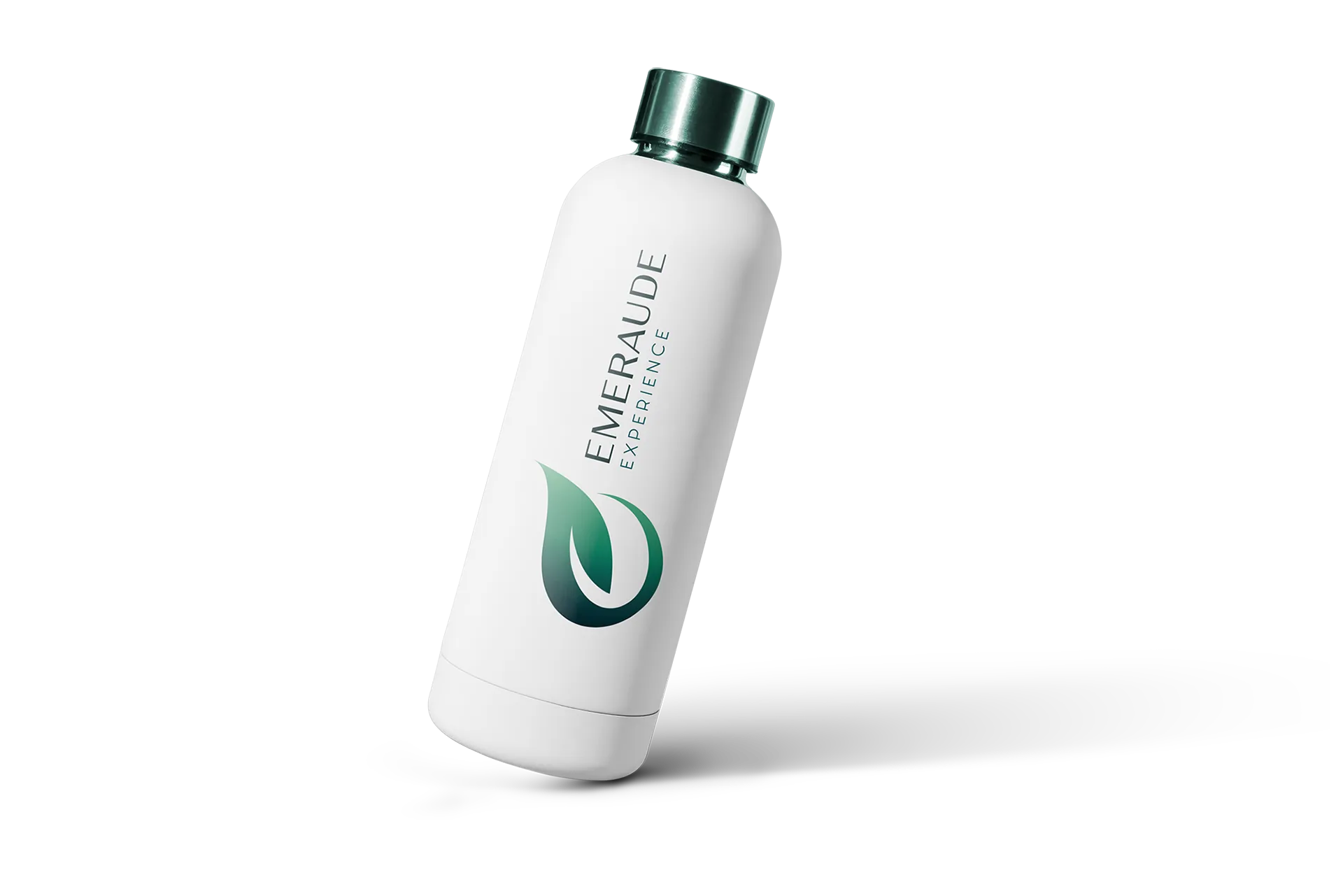
Brand identity for Groupe Loisirs Solutions, a company that runs three golf courses. They needed one name and one look to tie everything together, while still appealing to golfers, families and people who just want a nice lunch outdoors.
Three golf courses in the same region, each doing its own thing visually. Different logos, different materials, no link between them. The goal was to bring them under one brand so marketing actually adds up, without flattening what makes each spot different.
Two things to solve. Give a shared identity to three locations that looked totally separate. And shake off the "golf is exclusive" feeling to also bring in families and first-timers.
The logo is a leaf that forms an "E", with a dot above it for the golf ball. Deep-to-light green gradient, like the landscape of the courses themselves. The typeface leans upscale on purpose, but the overall feel stays approachable. Someone who's never held a club should still feel welcome.
Same materials, same tone, same visual language across all three courses. Each spot keeps its own character, but the group finally speaks as one.
The nature-and-wellness angle opens the door to people who'd never set foot on a golf course. Families, foodies, curious visitors. Golf as a destination, not just a sport.
Website, course signage, polo shirts, caps - everything comes from the same set of guidelines. It looks like a real brand now, not three separate clubs.